For my last year’s contribution to the .NET MAUI UI July event, I replicated the F1 TV app. This year I decided to replicate the Wolt app, which is a food delivery service here in Norway.
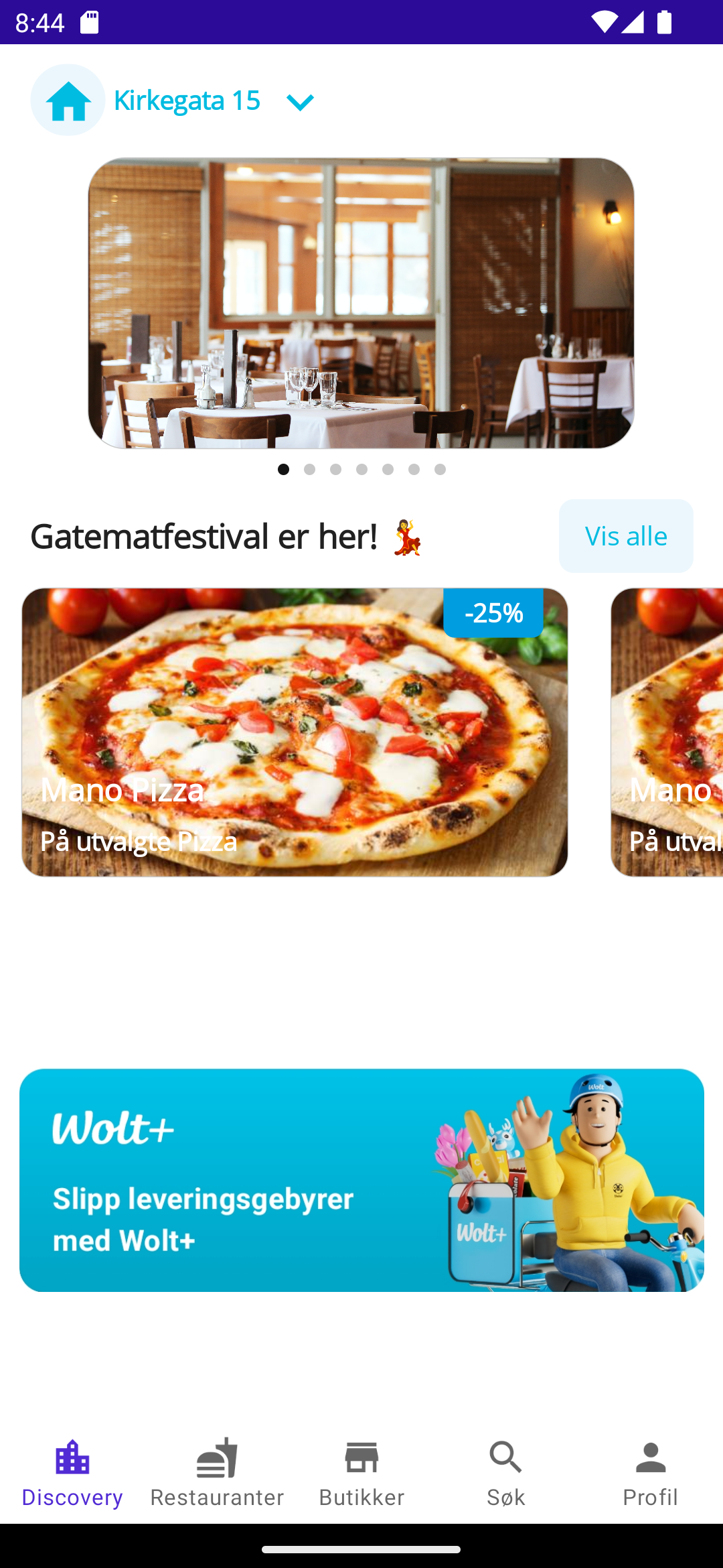
Here’s a screenshot of the Wolt app running on Android:
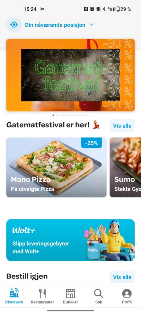
I will be replicating the “front page” of this app (as shown above), even though there are other screens to this app. Some things might be a bit off, like the font and the tabbar highlight color.
Getting started
Since this app uses some icons, I wanted to use the old reliable Material icons. I used this great NuGet package AathifMahir.Maui.MauiIcons.Material in order to easily use all the material icons directly in my XAML. Check it out here.
As a main page here, I am using a Tabbed Page, since the main view has a tab bar on the bottom.
Top section
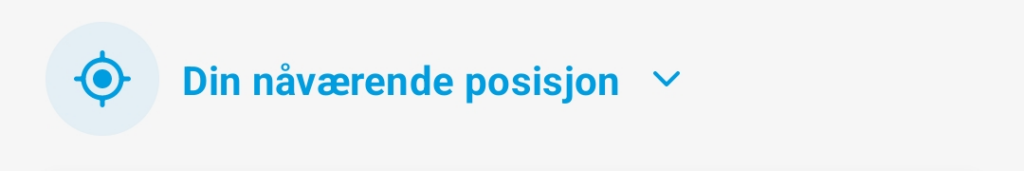
The top section displays your preferred location of delivery, which you can toggle with the expand button on the right. In this screenshot it says “Din nåværende lokasjon”, meaning “Your current location”. For demonstration purposes I have just made this a non-interactive MauiIcon using the NuGet package I mentioned (same goes for the GPS icon), but it could just as well have been a Button.
<HorizontalStackLayout Margin="16,10" VerticalOptions="Center">
            <Border
                Padding="6"
                BackgroundColor="#ecf7fd"
                Stroke="Black"
                StrokeThickness="0">
                <Border.StrokeShape>
                    <RoundRectangle CornerRadius="30" />
                </Border.StrokeShape>
                <material:MauiIcon
                    Icon="GpsFixed"
                    IconColor="#00bce1"
                    IconSize="22" />
            </Border>
            <Label
                FontAttributes="Bold"
                Text=" Din nåværende posisjon"
                TextColor="#00bce1"
                VerticalOptions="Center" />
            <material:MauiIcon
                Padding="6"
                Icon="ExpandMore"
                IconColor="#00bce1" />
        </HorizontalStackLayout>
Carousel section
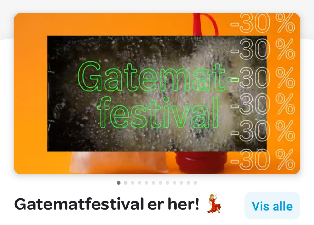
The carousel section displays some videos or still images of different restaurants or special offers. I used a CarouselView here, as it is the obvious choice for a carousel, with some hard-coded item templates for demonstration purposes. It also contains an IndicatorView, which are the ellipsis underneath the carousel. The section also contains a subtitle along with a Button to show all offers.
<CarouselView IndicatorView="indicatorView">
                <CarouselView.ItemTemplate>
                    <DataTemplate>
                        <Border WidthRequest="300">
                            <Border.StrokeShape>
                                <RoundRectangle CornerRadius="10" />
                            </Border.StrokeShape>
                            <Image HeightRequest="230" Source="restaurant.jpg" />
                        </Border>
                    </DataTemplate>
                </CarouselView.ItemTemplate>
                <CarouselView.ItemsSource>
                    <x:Array Type="{x:Type x:String}">
                        <x:String>test</x:String>
                        <x:String>test</x:String>
                        <x:String>test</x:String>
                        <x:String>test</x:String>
                        <x:String>test</x:String>
                        <x:String>test</x:String>
                        <x:String>test</x:String>
                    </x:Array>
                </CarouselView.ItemsSource>
            </CarouselView>
            <IndicatorView
                x:Name="indicatorView"
                Grid.Row="1"
                HorizontalOptions="Center"
                VerticalOptions="Center" />
            <Grid Grid.Row="2" Margin="16,0">
                <Label
                    FontAttributes="Bold"
                    FontSize="18"
                    HorizontalOptions="StartAndExpand"
                    Text="Gatematfestival er her! 💃"
                    VerticalOptions="Center" />
                <Button
                    BackgroundColor="#ecf7fd"
                    HeightRequest="40"
                    HorizontalOptions="End"
                    Text="Vis alle"
                    TextColor="#00bce1" />
            </Grid>
To fake the items in the list, I added some dummy items directly to the XAML as CarouselView.ItemsSource so that the item template would be duplicated X amount of times.
Featured section
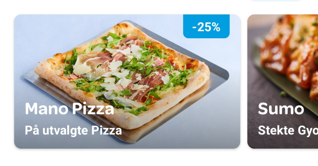
The featured section displays currently featured restaurants along with some offers. This is a horizontally scrolled list, so I went with a horizontal CollectionView. The item template uses some Grids to properly place the elements. The discount section uses Border in order to set the corner radius on selected corners.
 <CollectionView Grid.Row="2" ItemsLayout="HorizontalList">
            <CollectionView.ItemTemplate>
                <DataTemplate>
                    <Border Margin="10,0" WidthRequest="300">
                        <Border.StrokeShape>
                            <RoundRectangle CornerRadius="12" />
                        </Border.StrokeShape>
                        <Grid>
                            <Image HeightRequest="200" Source="pizza.jpg" />
                            <Grid RowDefinitions="28, *, 20, 40">
                                <Border
                                    Margin="0,0,14,0"
                                    BackgroundColor="#009de0"
                                    HorizontalOptions="End"
                                    StrokeThickness="0"
                                    WidthRequest="55">
                                    <Border.StrokeShape>
                                        <RoundRectangle CornerRadius="0,0,6,6" />
                                    </Border.StrokeShape>
                                    <Label
                                        FontAttributes="Bold"
                                        HorizontalOptions="Center"
                                        Text="-25%"
                                        TextColor="White"
                                        VerticalOptions="Center" />
                                </Border>
                                <Label
                                    Grid.Row="2"
                                    Padding="10,0,0,0"
                                    FontAttributes="Bold"
                                    FontSize="17"
                                    Text="Mano Pizza"
                                    TextColor="White" />
                                <Label
                                    Grid.Row="3"
                                    Padding="10"
                                    FontAttributes="Bold"
                                    Text="På utvalgte Pizza"
                                    TextColor="White" />
                            </Grid>
                        </Grid>
                    </Border>
                </DataTemplate>
            </CollectionView.ItemTemplate>
            <CollectionView.ItemsSource>
                <x:Array Type="{x:Type x:String}">
                    <x:String>test</x:String>
                    <x:String>test</x:String>
                    <x:String>test</x:String>
                </x:Array>
            </CollectionView.ItemsSource>
        </CollectionView>
Ad section
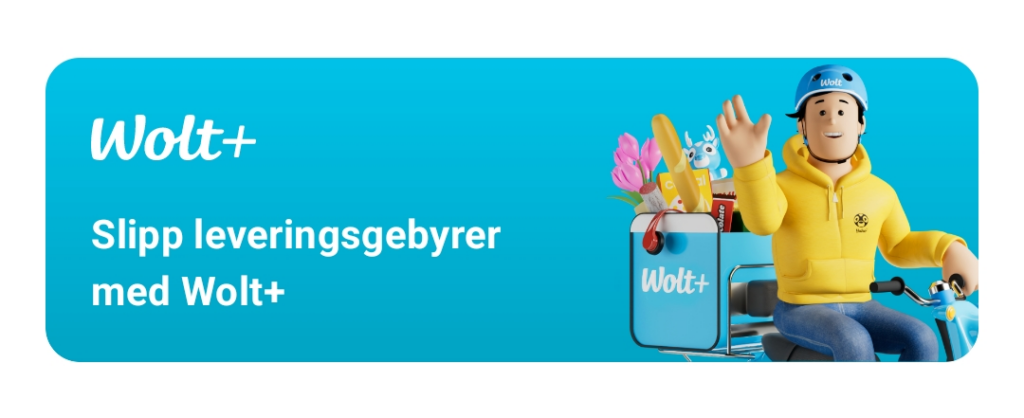
The bottom section contains an ad promoting some of the Wolt services. Here I opted for an easy route and just display this as an Image. If we wanted this to be clickable, we could have added a click event handler or used some EventToCommand-behavior to bind it to a command.
<StackLayout Grid.Row="3">
            <Image
                Margin="10"
                Source="ad.png"
                VerticalOptions="EndAndExpand" />
        </StackLayout>
Tab section
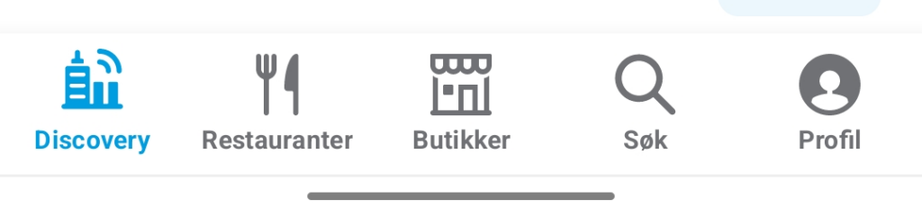
As mentioned in the beginning, the main page uses a TabbedPage to display the tabs at the bottom. I use the mentioned NuGet package to set material icons here as the icons.
Here’s how it looks in my tabbed page:
<TabbedPage
    x:Class="MAUIUIJuly2023.TabbedPage"
    xmlns="http://schemas.microsoft.com/dotnet/2021/maui"
    xmlns:x="http://schemas.microsoft.com/winfx/2009/xaml"
    xmlns:android="clr-namespace:Microsoft.Maui.Controls.PlatformConfiguration.AndroidSpecific;assembly=Microsoft.Maui.Controls"
    xmlns:local="clr-namespace:MAUIUIJuly2023"
    xmlns:material="clr-namespace:MauiIcons.Material;assembly=MauiIcons.Material"
    android:TabbedPage.ToolbarPlacement="Bottom">
    <local:MainPage Title="Discovery" IconImageSource="{material:Icon Icon=LocationCity}" />
    <local:MainPage Title="Restauranter" IconImageSource="{material:Icon Icon=Fastfood}" />
    <local:MainPage Title="Butikker" IconImageSource="{material:Icon Icon=Store}" />
    <local:MainPage Title="Søk" IconImageSource="{material:Icon Icon=Search}" />
    <local:MainPage Title="Profil" IconImageSource="{material:Icon Icon=Person}" />
</TabbedPage>
Notice how I’m setting the toolbar placement at the bottom, since the default location for tab bars on Android is at the top.
That’s a wrap!
I hope you liked this post and that you follow Twitter this month for all the other contributions that are coming. Check out Matt Goldman’s post for a full overview. The sample code for this Wolt app is located on my GitHub, check that out too!
1 thought on “MAUI UI July 2023 – Replicating Wolt app”